Massa Mãe
Year
2024
Type
Architecture, Design
A sourdough bakery in Lisbon with interiors and visuals designed to respect the movement of the breadmakers, the customers and, of course, the life of the dough.
Massa Mãe
Year
2024
Type
Architecture, Design
A sourdough bakery in Lisbon with interiors and visuals designed to respect the movement of the breadmakers, the customers and, of course, the life of the dough.
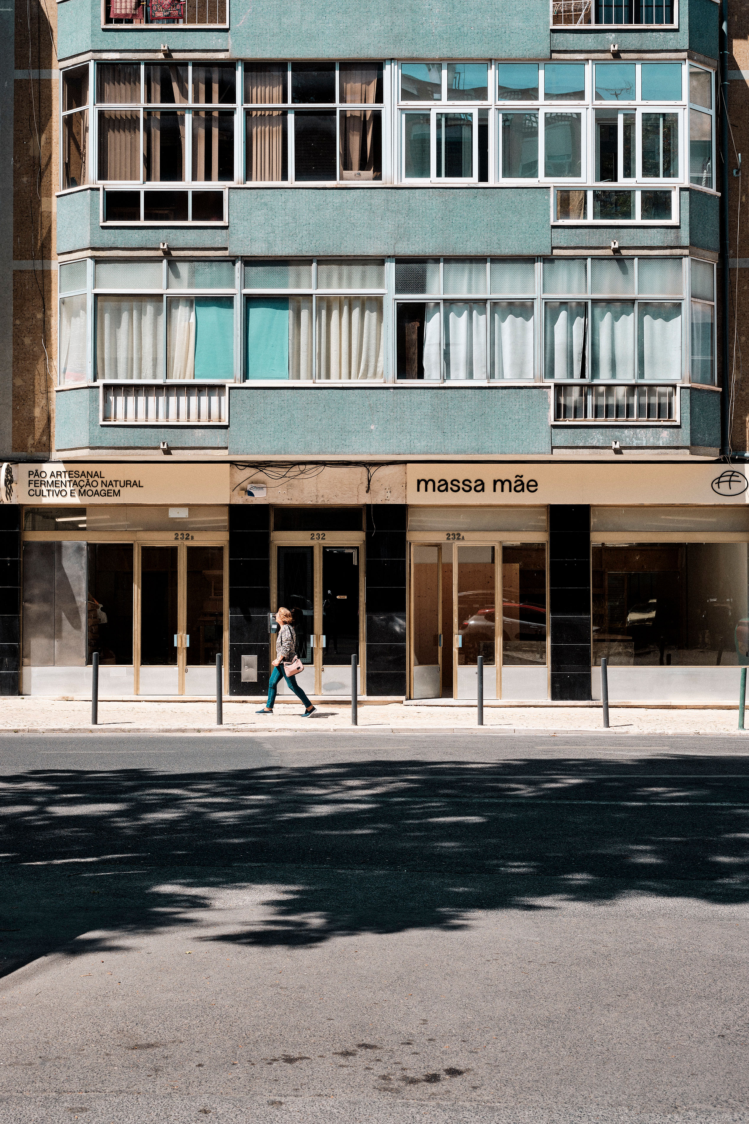


We were asked to design the interior and visual identity of a sourdough bakery in Lisbon. As stated in the client's brief, the interiors had to promote a seamless flow of people and goods, from the delivery of the grain to the production, preparation and baking of the bread.
As the space is U-shaped with several irregularities in the center, we associated each metaphorical leg of the U with a specific function: from where the flour arrives and is processed; to where the bread is sold. In the middle is a wooden block that defines the central area, allowing free space on the sides for a fluid circulation.
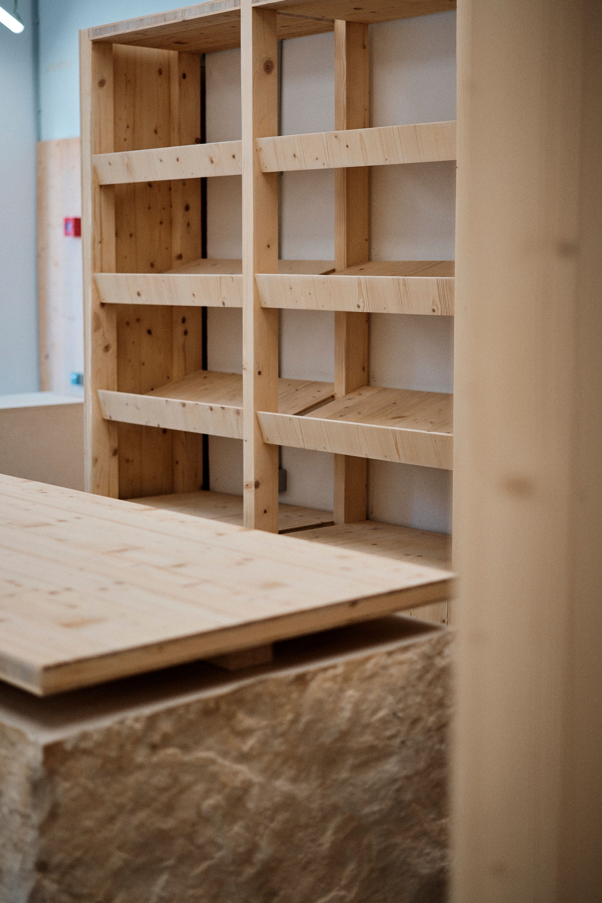
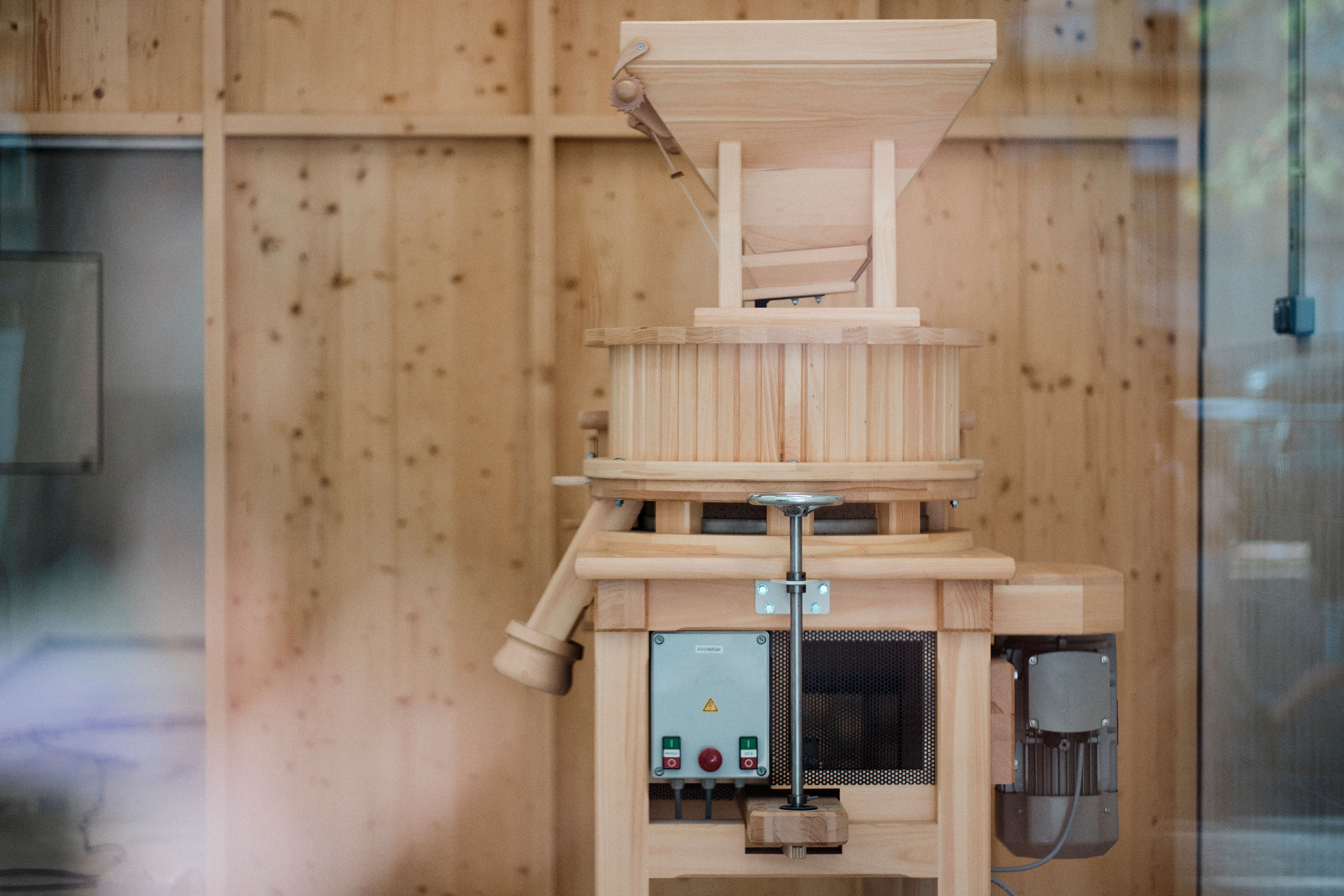
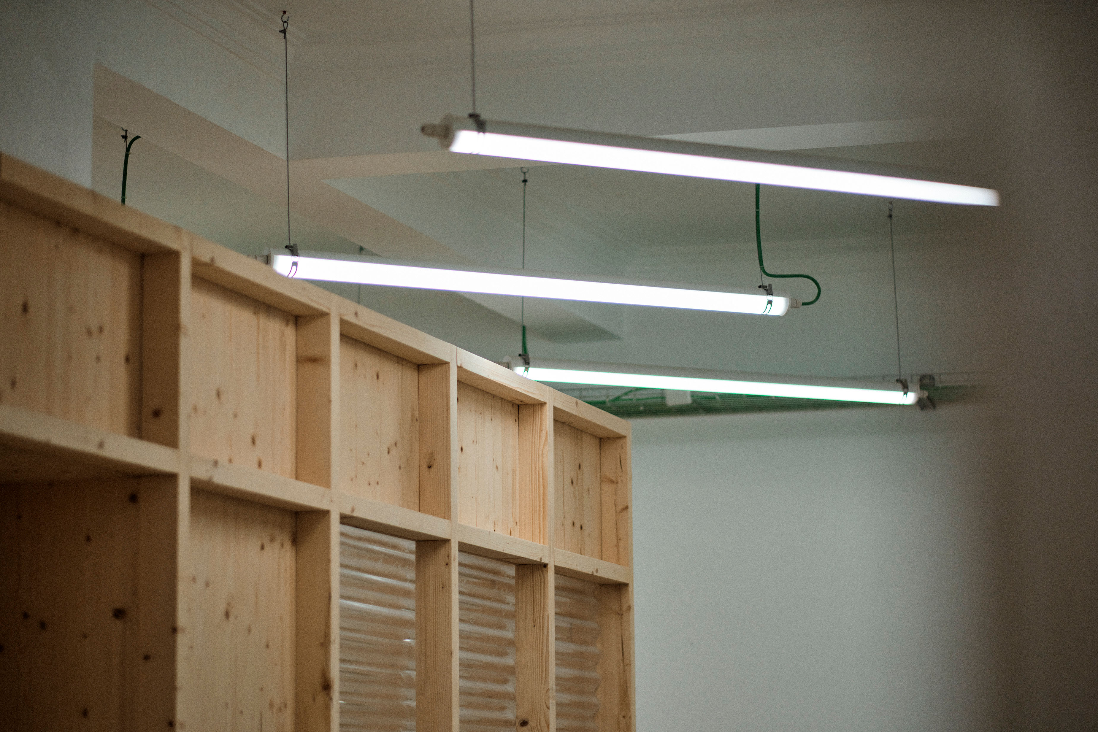
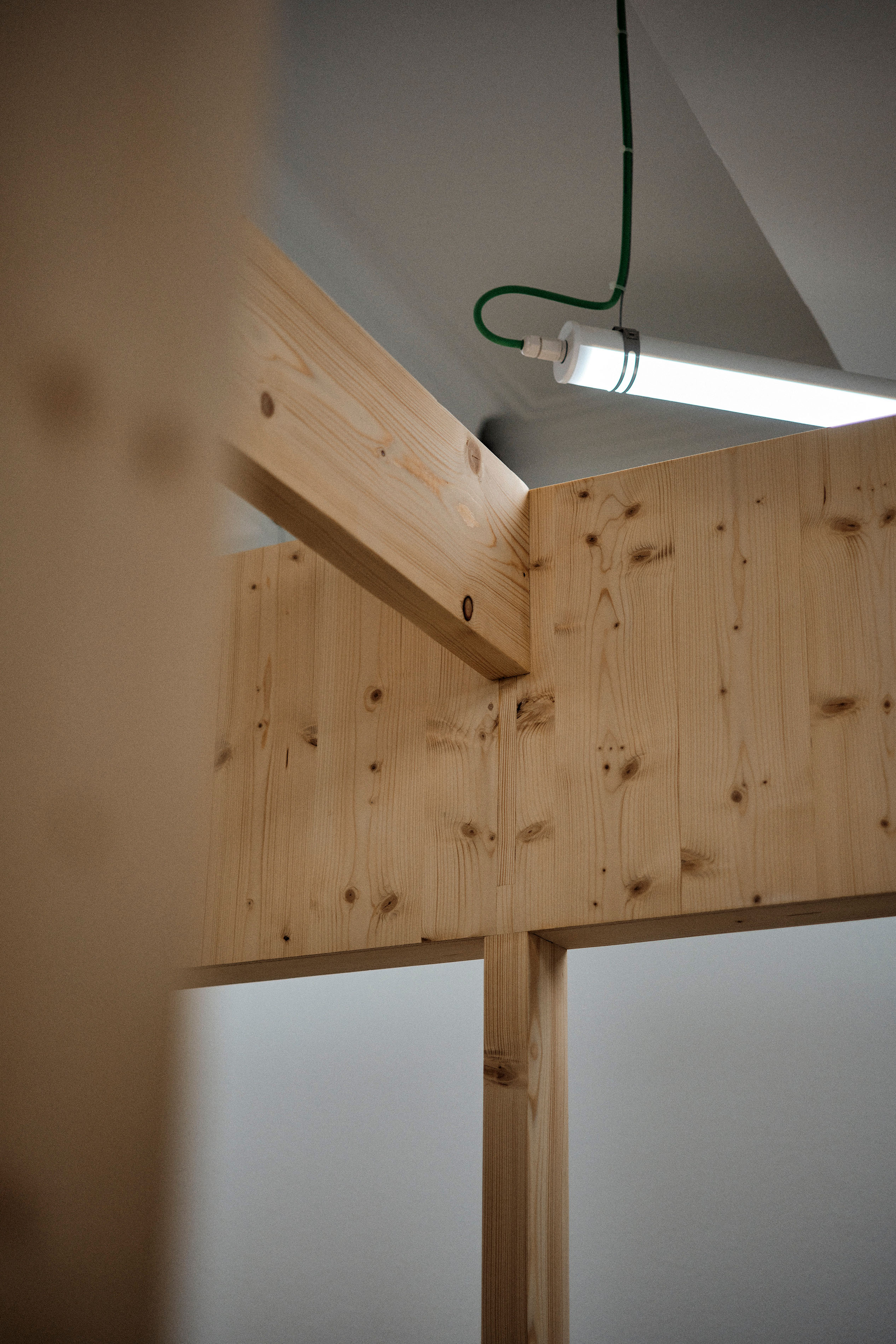
The inspiration for this project came from the old mills that were built with either stone or wood. For the interiors of Massa Mãe we used both: wooden beams with triple-layered panels for the centrepiece and solid stone for the service counters. By playing with the contrasting surfaces of the materials, one smooth and the other rough, our aim was to create a visual aesthetic that doesn't look like a traditional bakery, but like a mill.
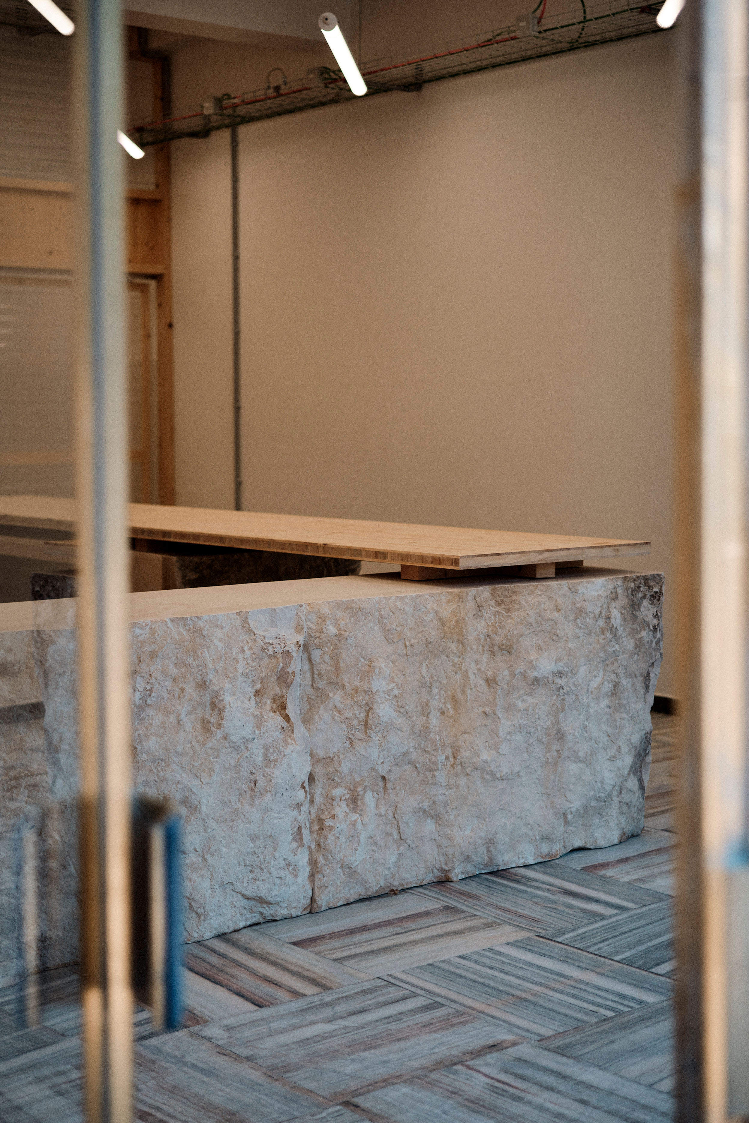


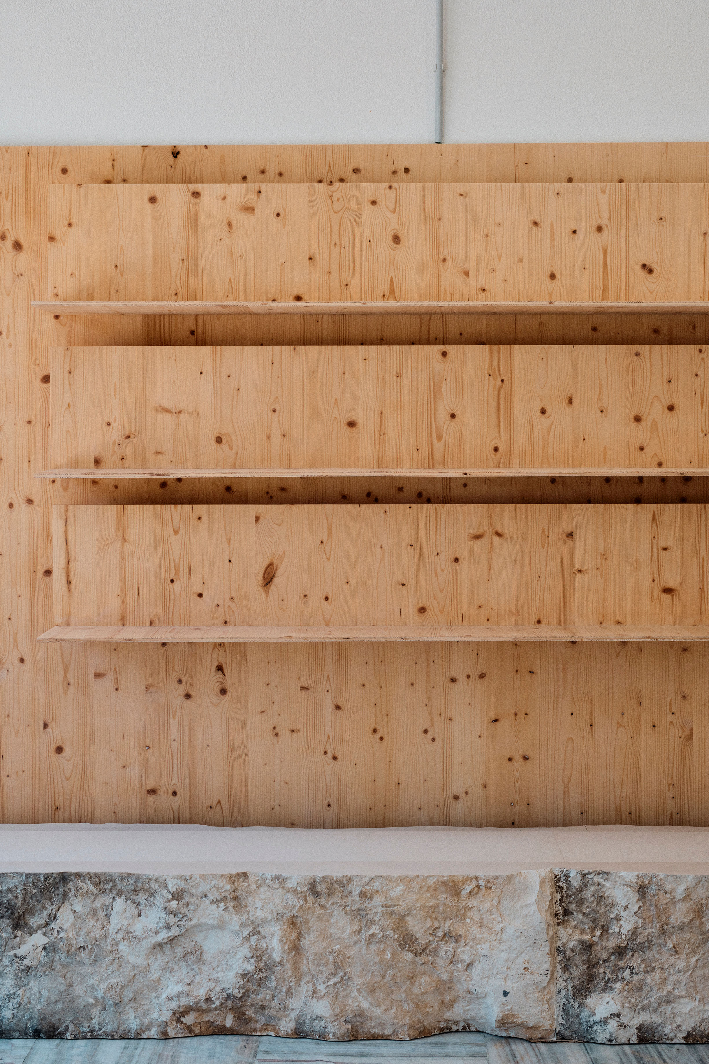
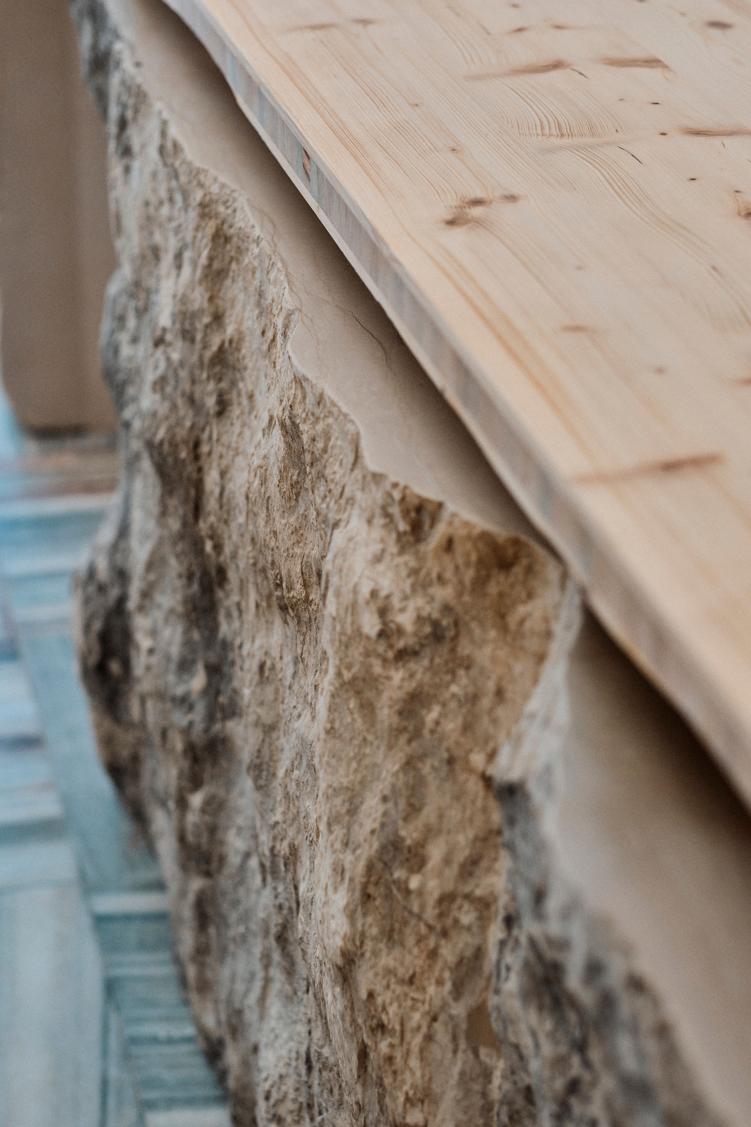




This more conceptual approach to the project would only make sense if it was clear from the outside that the space was indeed a bakery. We created wooden structures to display large quantities of freshly baked bread, making the bread-making process visible from the outside. This proved to be a good way of promoting the bread and attracting curious passers-by.
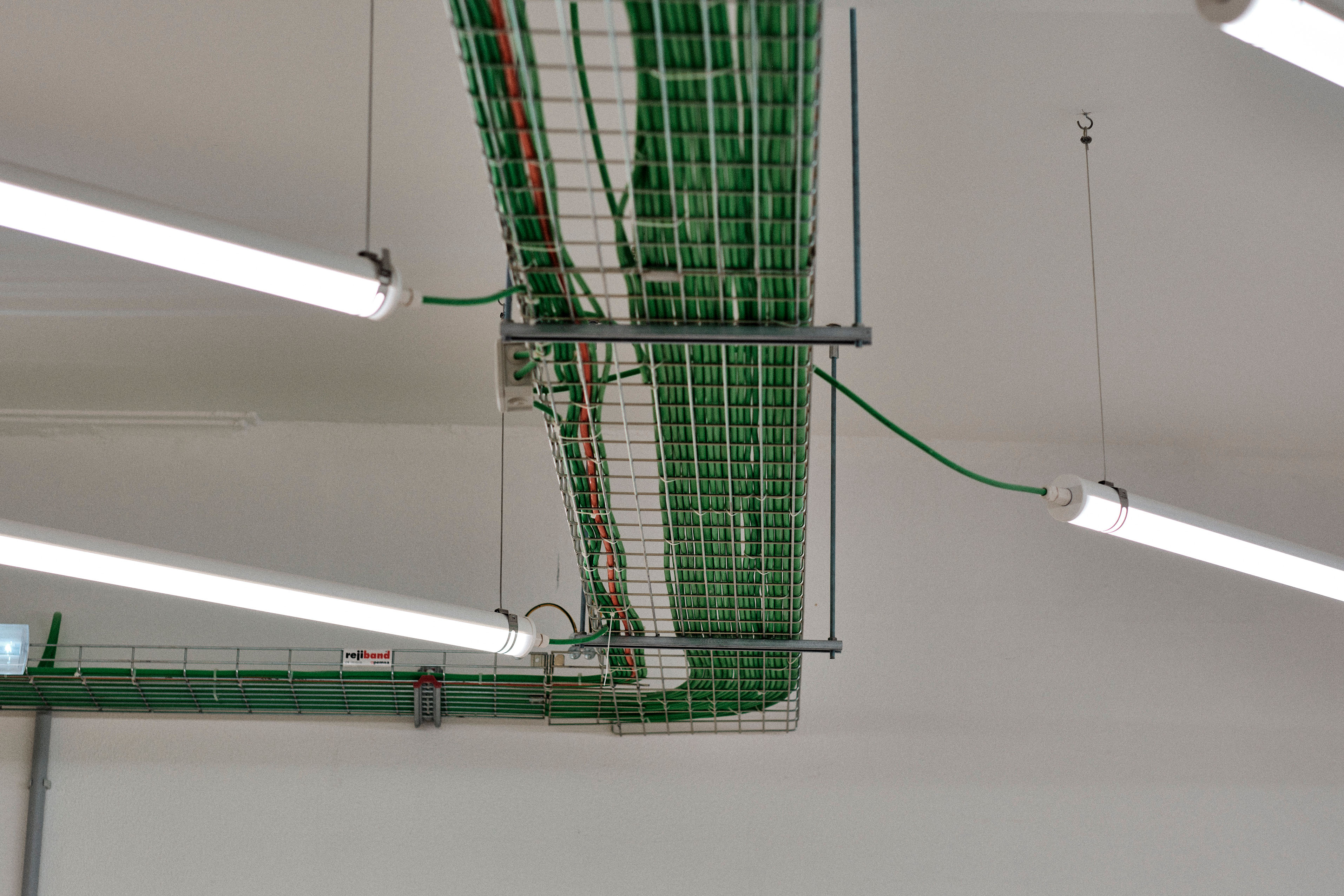
Once inside, look up and you will find the light in unusual positions. Diagonal and mirrored in each of the wings. It's our way of honouring the wheat ear. To ensure visibility and natural light in the production area, the windows are covered with corrugated polycarbonate panels.



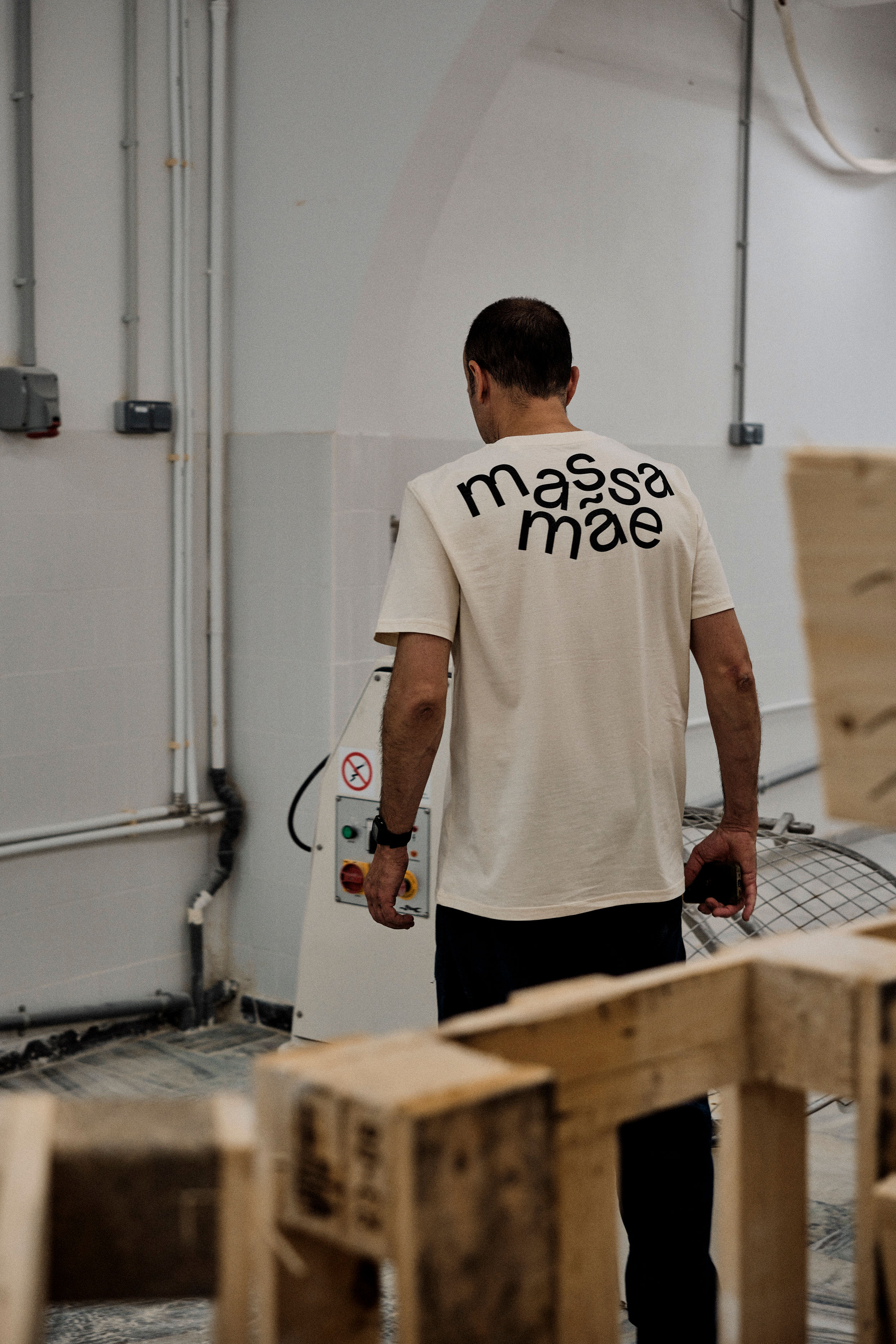
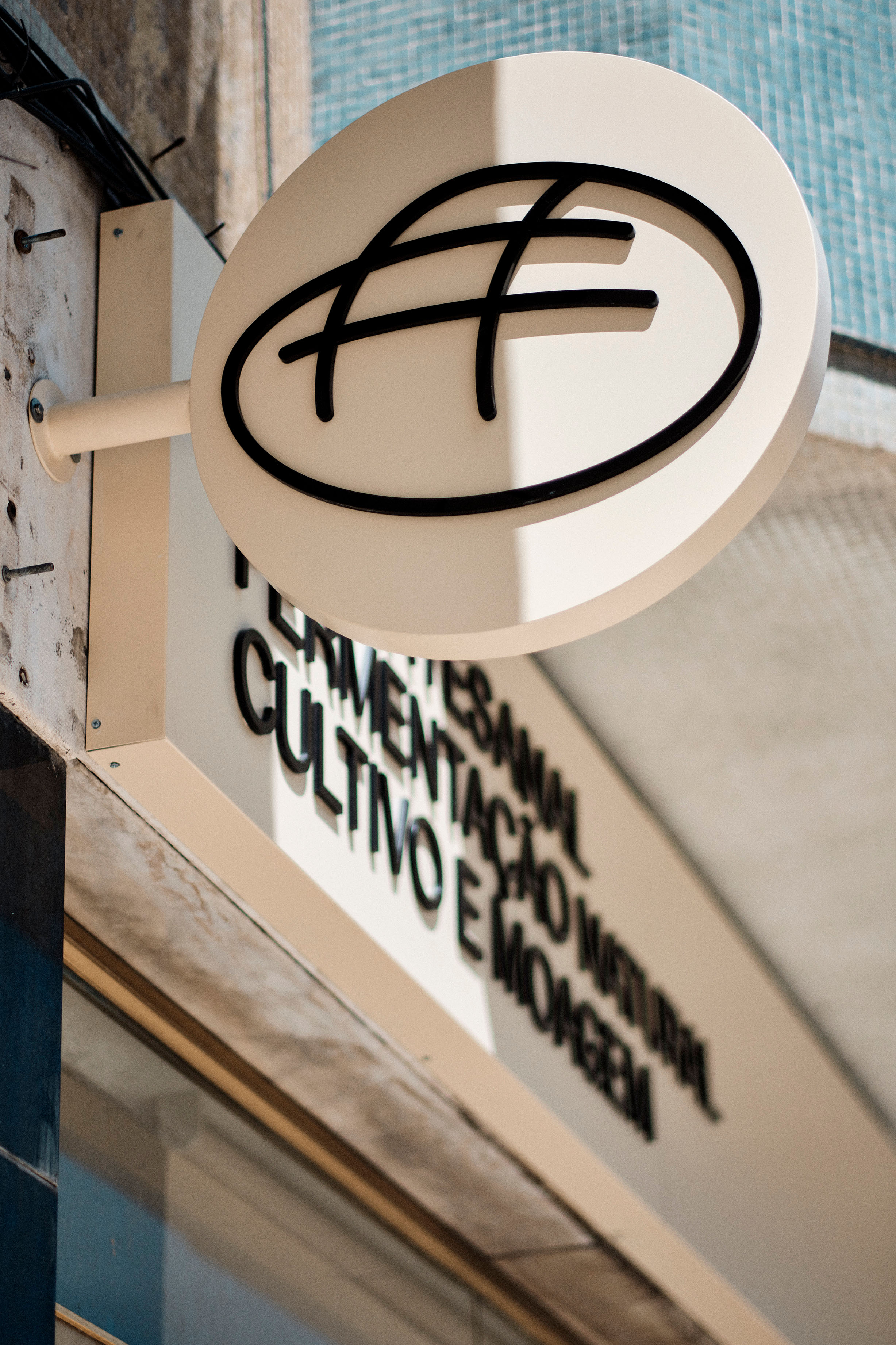
To create the Massa Mãe logo, we designed an easily recognisable single-line drawing of a loaf, concealing a complex grid of curves. A metaphor for the methodical craftsmanship of bread making. For the typeface, we were inspired by the process of kneading, weighing and cutting just the right amount of dough. If you look closely, you'll see a representation of this movement in the letter 'a'.

To create the Massa Mãe logo, we designed an easily recognisable single-line drawing of a loaf, concealing a complex grid of curves. A metaphor for the methodical craftsmanship of bread making. For the typeface, we were inspired by the process of kneading, weighing and cutting just the right amount of dough. If you look closely, you'll see a representation of this movement in the letter 'a'.

To create the Massa Mãe logo, we designed an easily recognisable single-line drawing of a loaf, concealing a complex grid of curves. A metaphor for the methodical craftsmanship of bread making. For the typeface, we were inspired by the process of kneading, weighing and cutting just the right amount of dough. If you look closely, you'll see a representation of this movement in the letter 'a'.






Interested in learning more about our projects? Contact us to discuss your architectural or design needs.
Interested in learning more about our projects? Contact us to discuss your architectural or design needs.
Interested in learning more about our projects? Contact us to discuss your architectural or design needs.
Client
Massa Mãe
Use
Commerce
Work
Interior Design
Visual Identity
Custom Typeface
Visual Identity
Location
Lisbon, Portugal
Team & Collaborators
Inês Moreira
/ Architect, Creative Direction
Miguel Moreira
/ Graphic Designer, Creative Direction
Juliette Rabelle
/ Intern Graphic Designer
PAAU
/ Woodworker
Furniture
Designed by IMCOLLECTIVE
Photography
Rui Freitas
imcollective ©2025 · imprint · shipping & returns · livro de reclamações